Sézane Catalog

Catalogue Design

For Sézane

Design Brief

I was asked to create a bilingual (French and English) catalogue for a company and product of our choice.

The Result

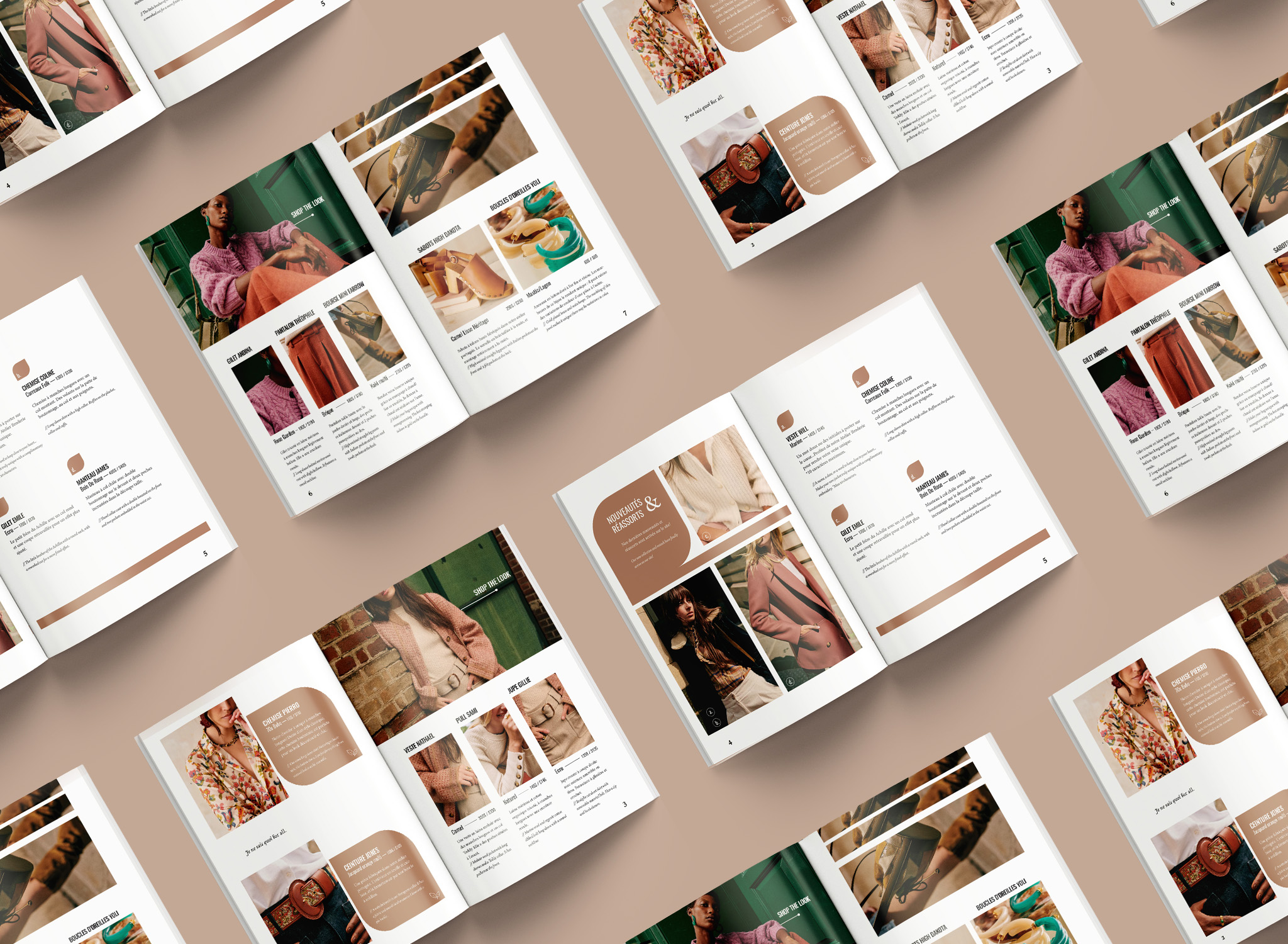
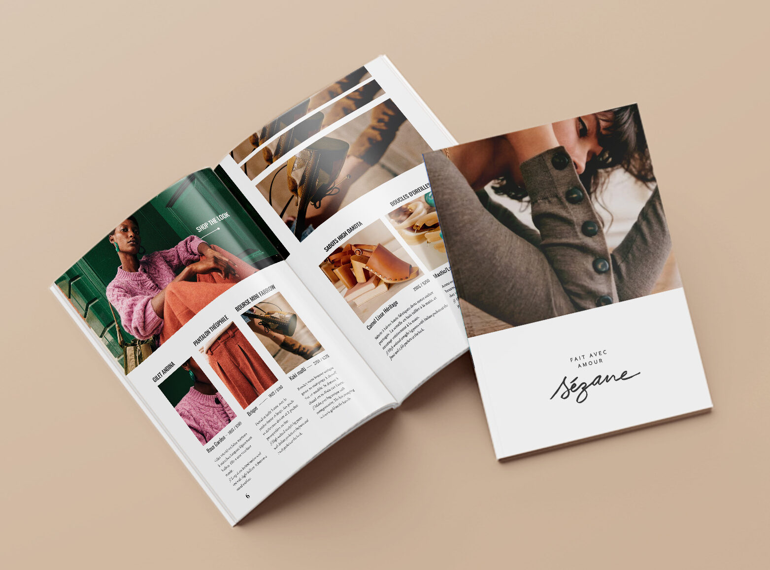
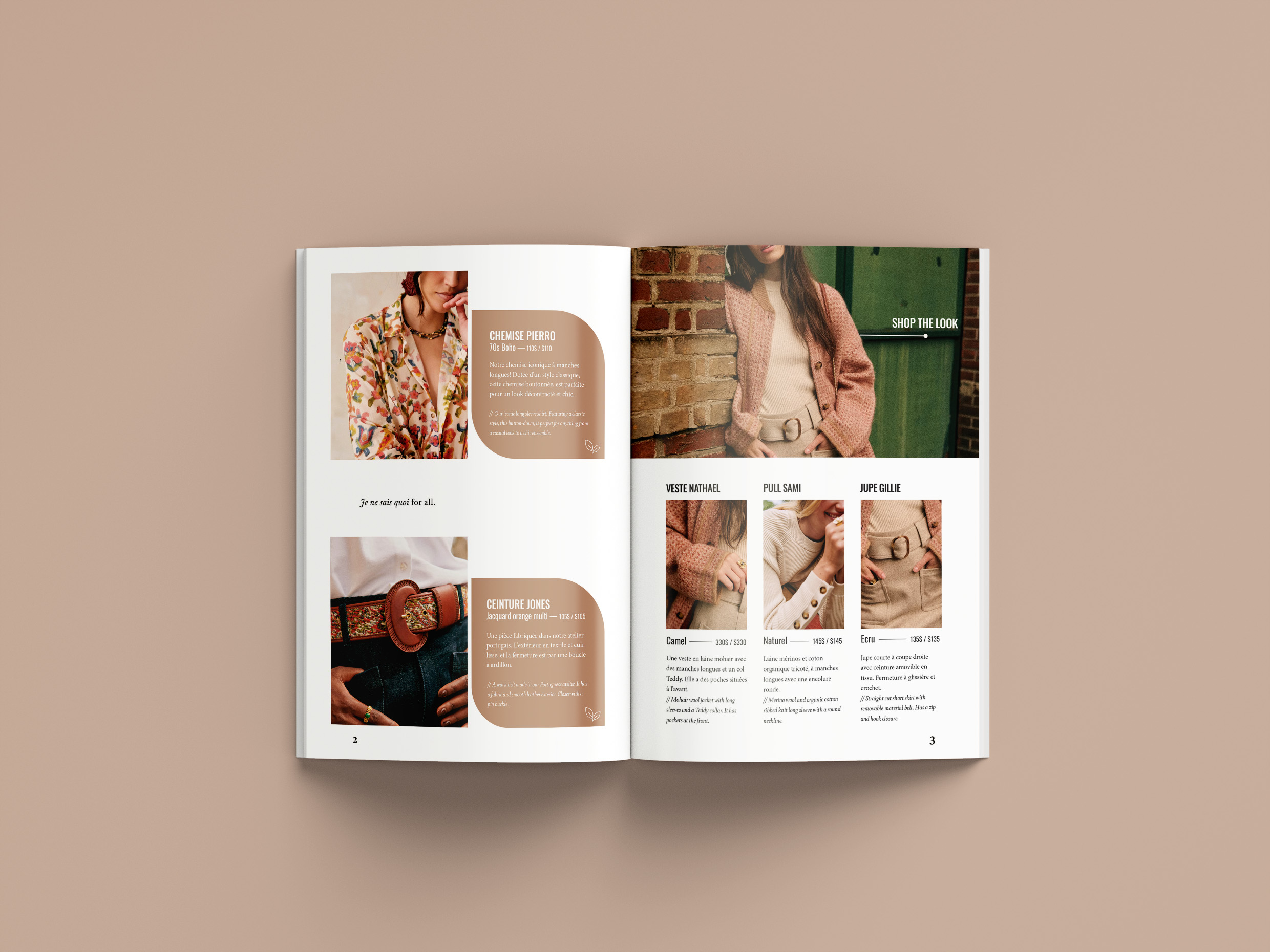
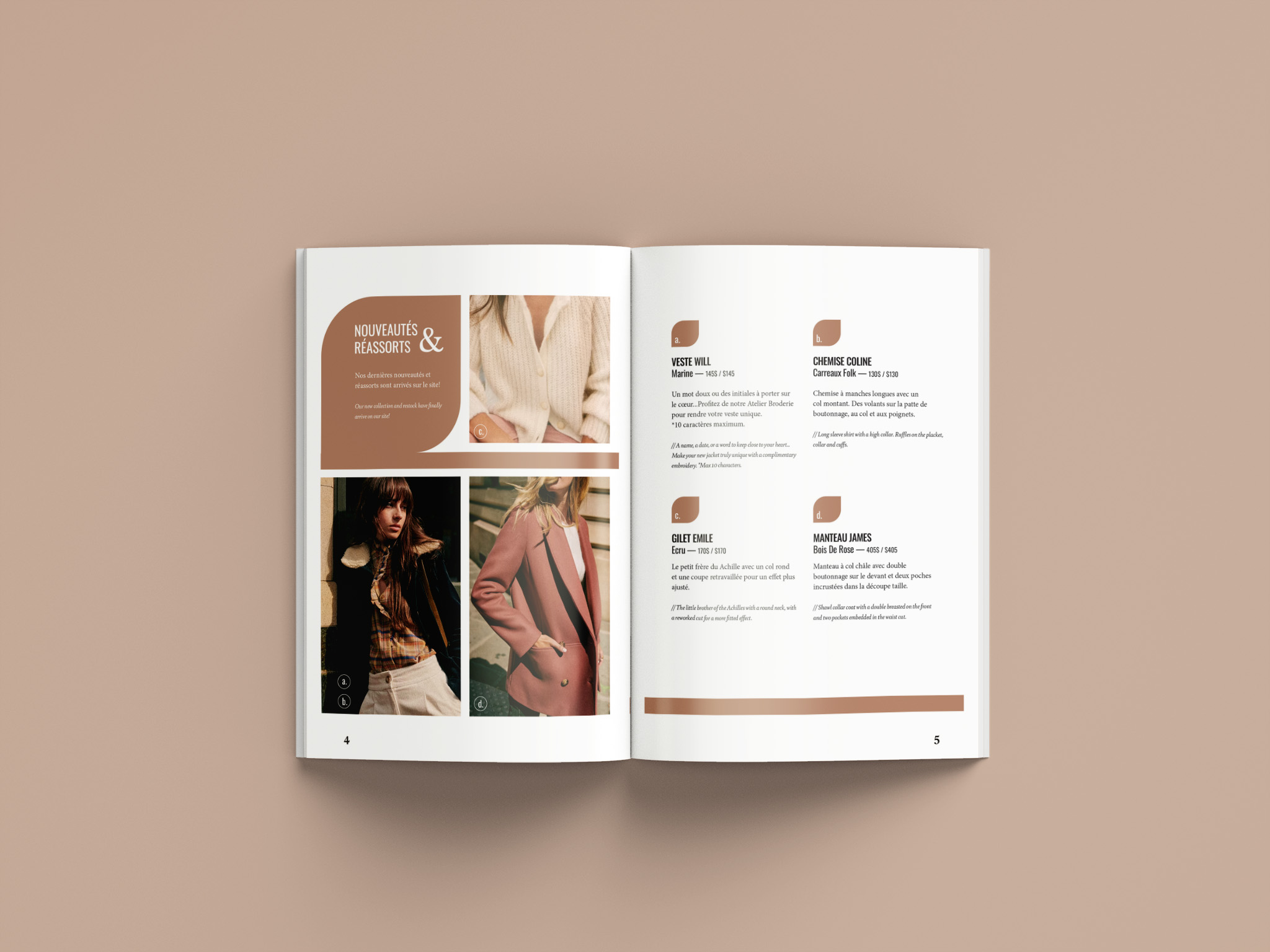
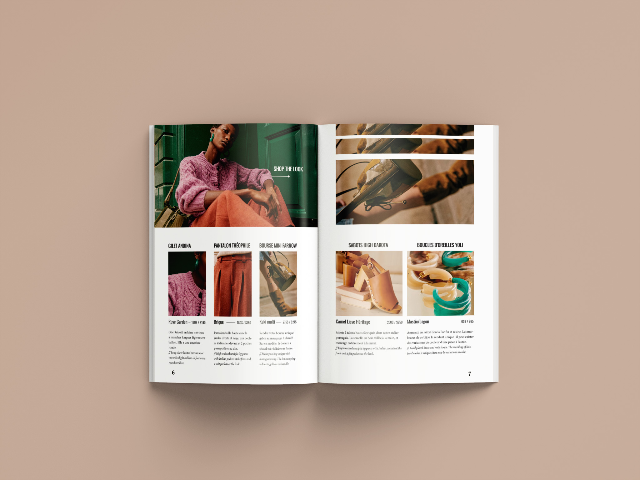
Following this brief, I chose the clothing brand Sézane and decided to use their newest clothing collection for the content of the catalogue. The overall design of the catalogue strives to reflect the brand’s existing look and feel, while incorporating compelling layouts that would display both French and English translations in a way that is pleasing to look at, and that does not appear busy or cluttered. My goal was to let the pieces of the collection speak for themselves using large visuals as the primary focus in the catalogue.

The image displays a variety of spreads taken from the print catalogue based on the fashion brand Sézane. The pages are put on a taupe background.
This image is one of the spreads from the Sézane catalogue, alongside the cover. It includes images of pieces from the collection along with written descriptions of the pieces that include their name and price. The whole spread has a clean and minimalist look.
This image is one of the spreads from the Sézane catalogue, completed in Publication design class. It includes images of pieces from the collection along with written descriptions of the pieces that include their name and price. The drawn visuals are done in a taupe colour and the whole spread has a clean and minimalist look. Used in the slideshow.
A continuation of spread one, this image is the second spread from the Sézane catalogue, completed in Publication design class. It includes images of pieces from the new collection along with written descriptions of the pieces that include their name and price. The drawn visuals are done in a taupe colour and the whole spread has a clean and minimalist look.
A continuation of spread two, this image is one of the spreads from the Sézane catalogue, completed in Publication design class. It includes images of pieces from the collection along with written descriptions of the pieces that include their name and price. There are no drawn visuals on the spread but it maintains the same clean and minimalist look as the others. This spread's colour palette includes jewel tones.

My Process

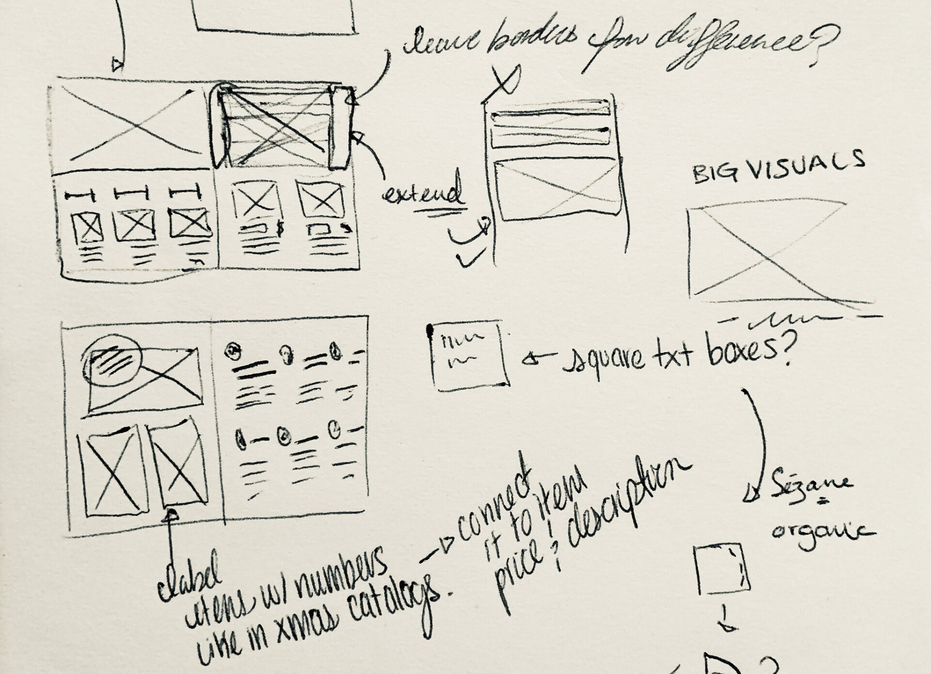
Starting with some initial sketches to brainstorm layout options, I was able to efficiently determine how my content would be distributed across the catalogue spreads. From there, using the brand’s website for reference, I established the colour palette made up of warm, natural colours that also expressed a level of elegance. I wanted to make sure the colour palette and type reflected the brand’s existing aesthetic, respected their guidelines, and mirrored the look of their new collection at the time, which that the catalogue was showing.

Having prepared all the remaining materials, I then referred to the brainstorming sketches that I had made to build the final layout using Adobe InDesign.

Rough sketches and Brainstorming for the Sézane catalogue.