Sucasa Tacos
Sucasa Menu
Bilingual Kids Menu
A little bit about the process…
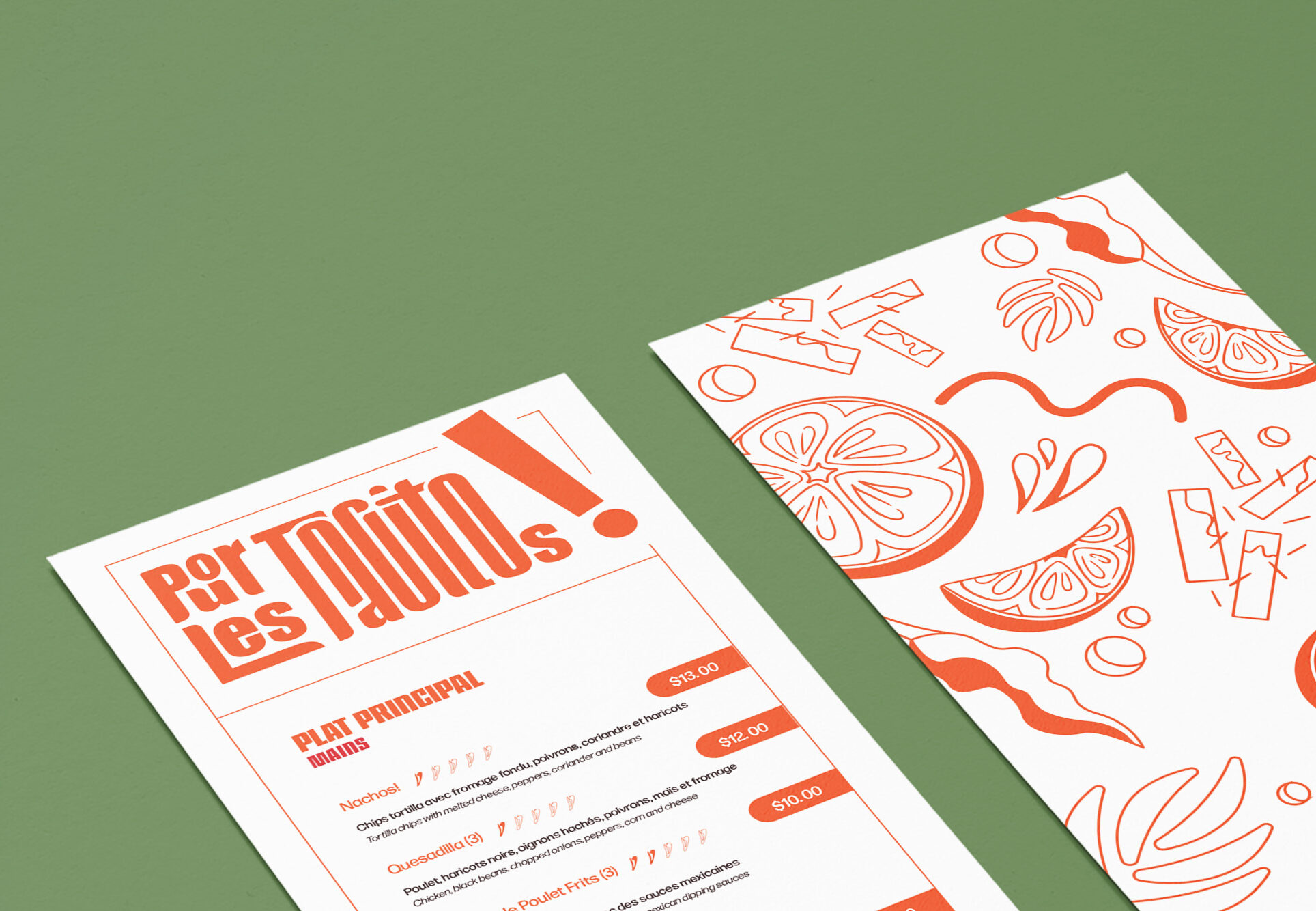
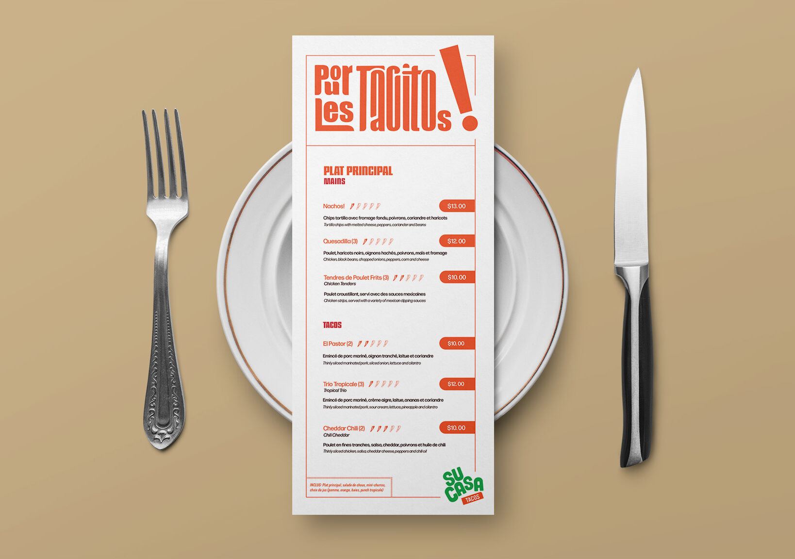
For the menu, I wanted to create a kids menu that met the needs of a family-oriented restaurant. Considering that waiting for food at a restaurant can seem long and tedious, especially to energetic little ones, I wanted to create a design that allows kids to colour and have fun while waiting for their food. This also gives the parents a much needed break to enjoy the restaurants warm atmosphere and good food.
Sustainability Factor
Many places have paper place mats for children to colour but the constant need to print new menus can become costly and if they get food on the menus, it’ll often ruin the paper. Meaning, it will have to be thrown in the trash rather than recycled.
The Solutions
To address this issue, I decided to create a reusable drawing sheet included on the menu. In this way, they would not need to be reprinted and the lamination protects it from the inevitable messes that can occur in a restaurant setting. Furthermore, these drawing sheets can be switched to match specific events and/or restaurant promotions without reprinting the whole menu, thanks to the way it is laminated. Children can be given dry erase markers to colour in the menu making it multi-purpose, efficient and environmentally responsible.
Magazine Advertisement
Time For Tacos
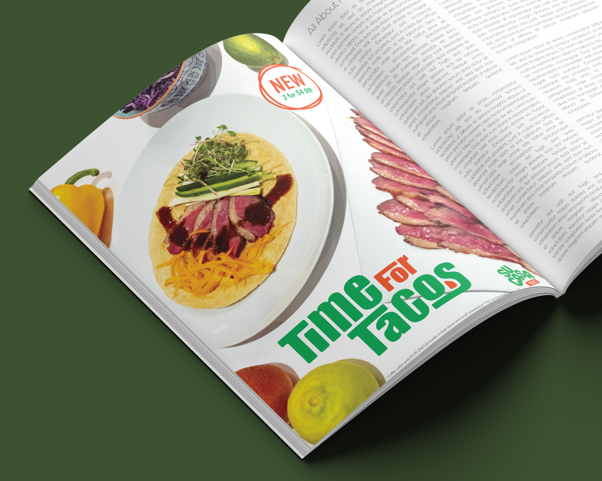
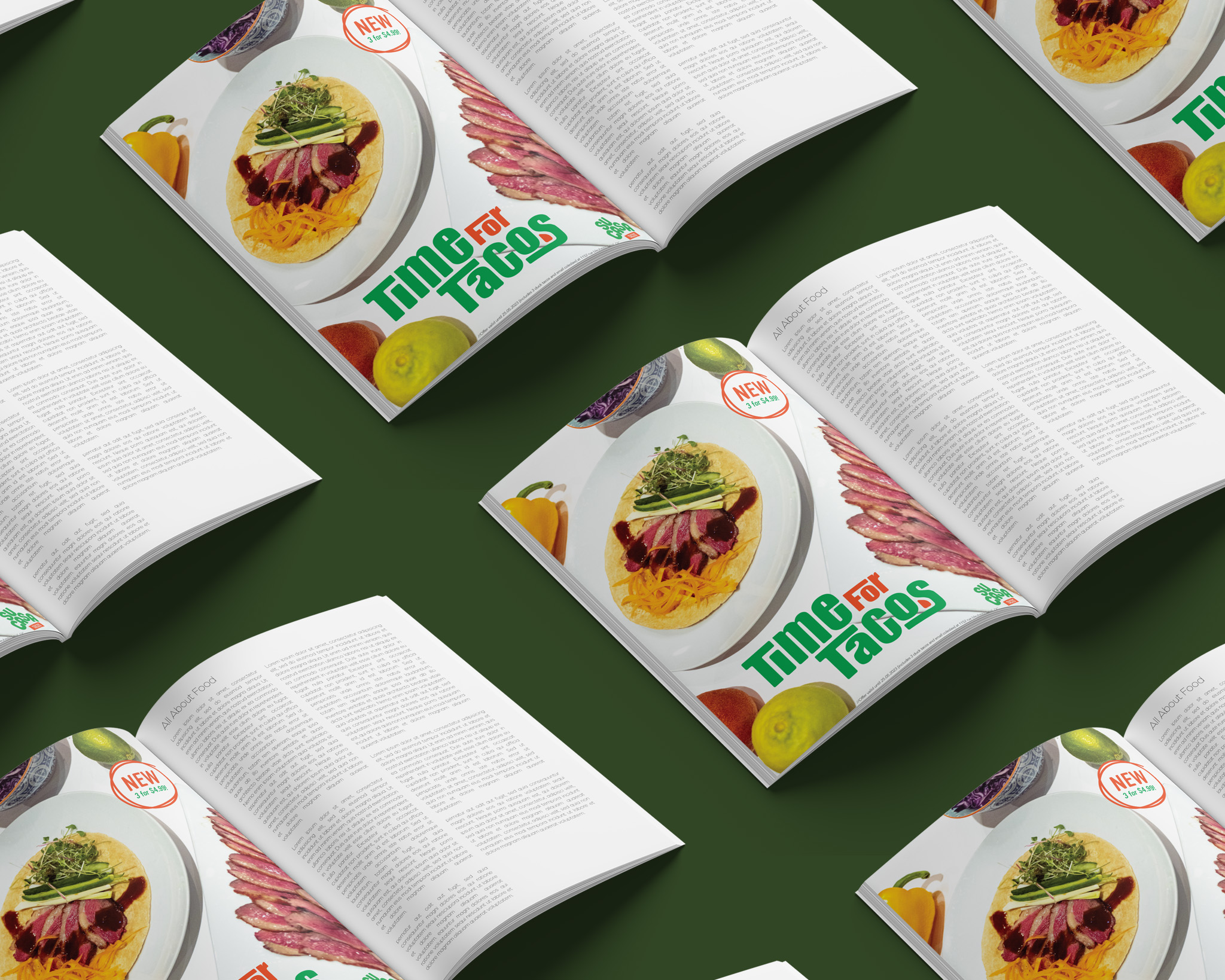
One of the advertising materials we had to create for our fictional restaurants was a print advertisement to be used in a magazine or newspaper. In my case I made an advert for a magazine promoting a new taco being added to the menu at SuCasa. I made sure to position and photograph the food on a white background in order to allow the vibrant colours present in the dishes to contrast nicely against the backdrop and edited the image accordingly. The text was then added using Adobe Indesign.
