Personal Branding
Logo
Some context…
I originally created some personal branding for a business card at the end of first year. However, I have since learned a lot about design and further developed my personal design style a lot more. So, when given the opportunity, in the form of our first illustration assignment where we were asked to create a logo for ourselves, I used it to put my new skills to work. I wanted to design something more inline with my current identity as a graphic designer and that reflected the type of clientele I would want to work with. The picture on the left is what I had made in first year, and on the right is the most current version. Also, the new logo and branding has since been used for this website and also for my design account on Instagram (@skyes.creation).
Personal Branding
Business Cards
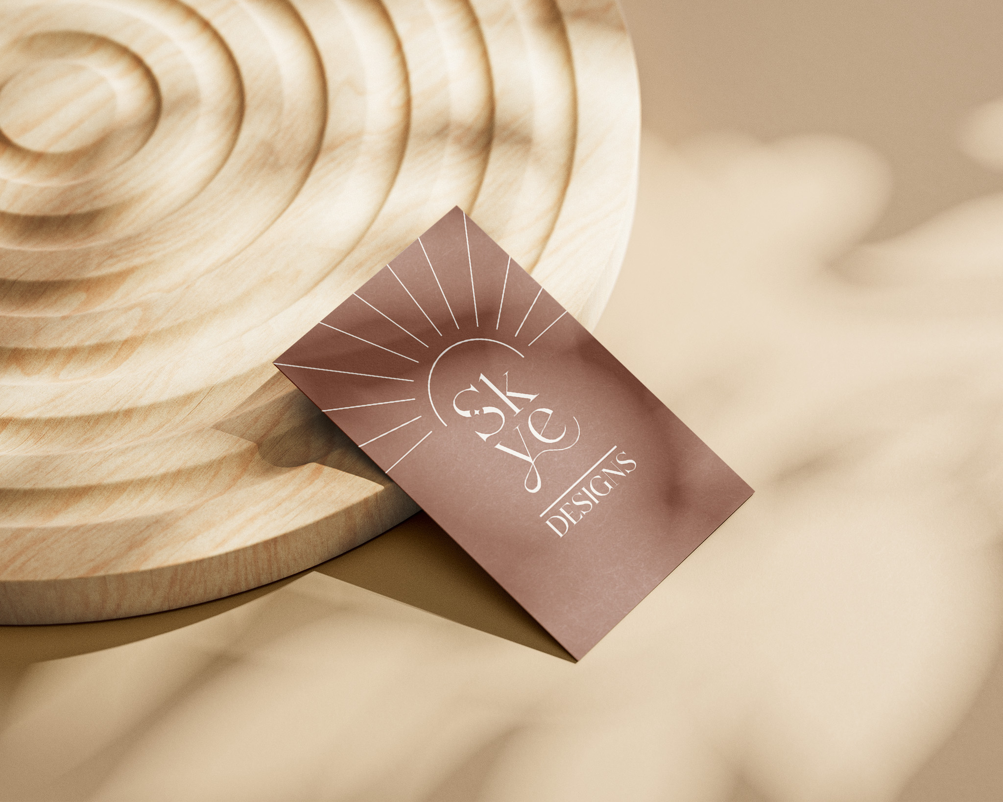
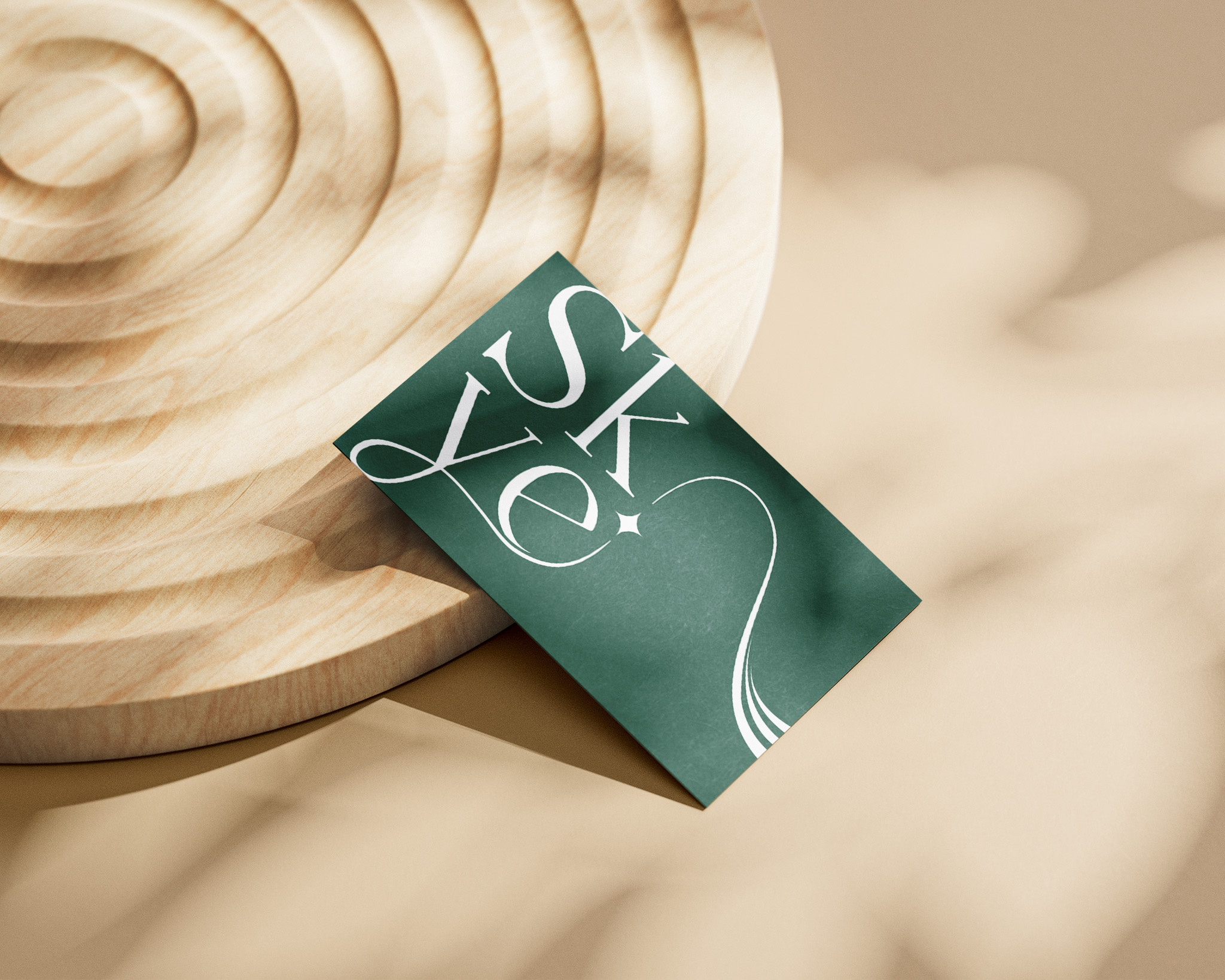
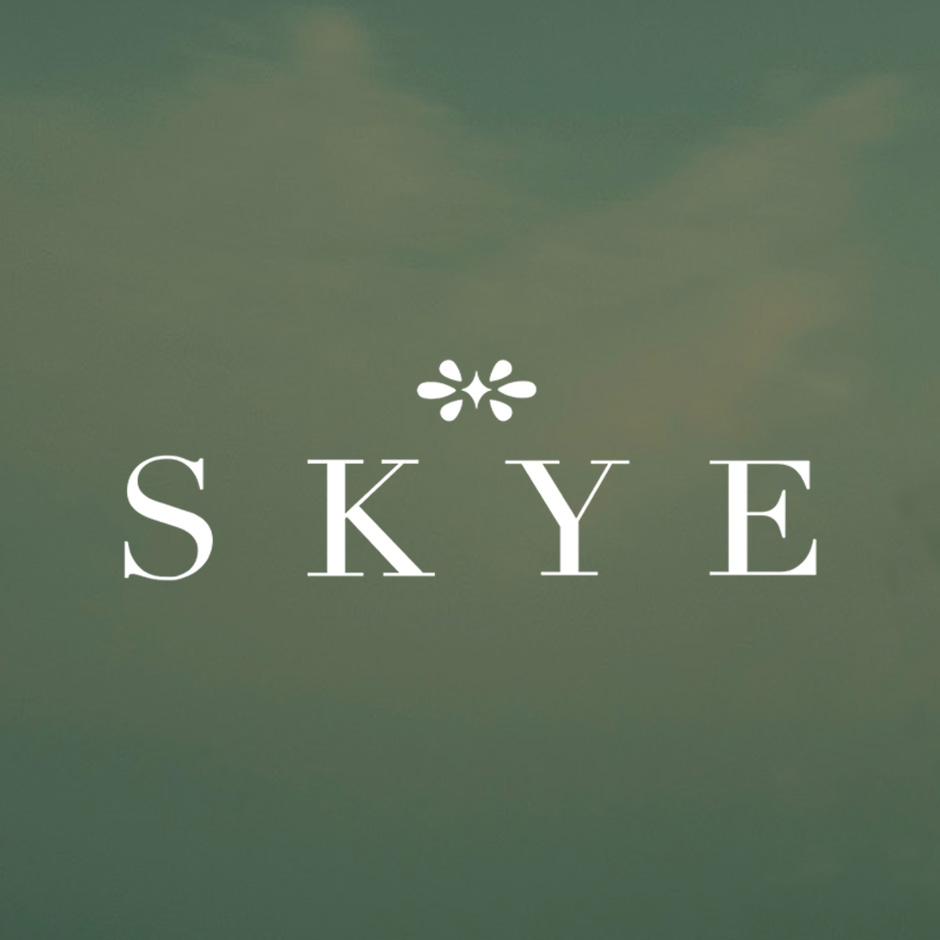

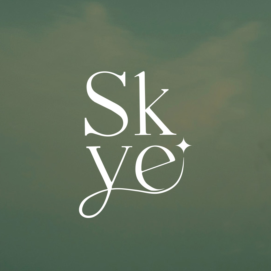

Using the new branding, I redesigned my former business cards (left), although not too much has changed between the two, I believe that the newer ones (right) show a level of refinement that was not there before and although I still enjoy my older design, the new one feels more developed and focused than the former. The 4 images below the cards display the new wordmark, icon, stacked logo and a visual branding element.
